Typography
P22 Posada Regular
AaBbCcDdEeFfGgHhIiJjKkLlMmNnOoPpQqRrSs
TtUuVvWwXxYyZz1234567890!@#$%&?
Clarendon Regular
AaBbCcDdEeFfGgHhIiJjKkLlMmNnOoPp
QqRrSs TtUuVvWwXxYyZz
1234567890!@#$%&?




Mateo's Salsa
Rebrand
Hypothetical redesign for an Advanced Graphic Design Course
Services: Package Design, Brand Redesign
Packaging Tone: Modern, Playful, Western.
Target Audience: Salsa enthusiasts, those who value clean ingredients, bold flavor, and salsa that feel thoughtfully crafted yet approachable, casual entertainers.
Mateo’s Salsa is a Texas-born brand founded in 2010 by entrepreneur Andrew Robbins with a simple goal: to create a better, more flavorful alternative to traditional store-bought salsa. What began as a small, passion-driven recipe quickly gained traction through word-of-mouth, evolving into a nationally distributed product known for its bold taste and clean, all-natural ingredients.
Built on the idea of delivering “gourmet” quality in an accessible format, Mateo’s carved out a unique space between mass-market convenience and premium flavor, offering a range of salsas—from classic to more adventurous varieties—across major retailers like Costco and Walmart. Over time, the brand grew into one of the largest independent salsa companies in the United States, recognized for its proprietary recipes and strong consumer following.


Original Mateo's Mild, Medium, and Hot Salsa Labels
Task
The brief given was to choose a product in a grocery store, that we felt needed a rebrand or simply needed changes to its overall packaging/branding.
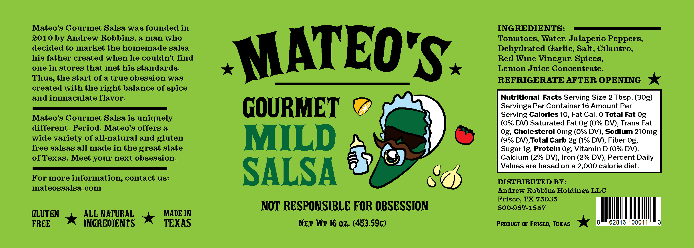
I chose Mateo's to work with as I felt its label at the time lacked some key foundations in design within its packaging. The label struggled with clarity, hierarchy and clutter that made the product less effective at capturing attention and communicating product differences, such as heat level quickly on the shelf.
Goal
The goal for this packaging rebrand is to modernize the visual identity, improve readability, and create a more cohesive and elevated presence that better aligns with the quality of the product while also improving the ability to distinguish the different heat levels.
This redesign aims to establish a more intentional and contemporary design system that simplifies communication, strengthens shelf impact, and draws consumers in through clearer typography, stronger structure, and a more refined visual language that stands out against competitors.
Solution
I chose to lean into Mateo’s Texas roots by introducing a Western woodtype-inspired typeface, influenced by old WANTED posters, to reinforce authenticity, character, and sense of place. This typographic direction was used as both a conceptual and functional solution—strengthening the brand’s connection to its Tex-Mex heritage while also improving readability and shelf recognition. By grounding the type system in historical Western references, the identity feels more distinctive and culturally rooted, helping Mateo’s stand apart in a crowded salsa category and feel more intentional and ownable.
The redesign also focuses on refining the typographic hierarchy to create a clearer and more intuitive reading experience. Key information such as the brand name, flavor, slogans, and product descriptions were reorganized to establish a stronger visual order, allowing consumers to quickly scan and understand each variant at a glance. Alongside this, the color system was restructured to better communicate heat levels, using distinct and purposeful color cues to clearly differentiate mild, medium, and hot varieties. These adjustments improve shelf clarity, enhance usability, and create a more cohesive packaging system that supports faster recognition and better navigation across the full product line.
Lastly, I retained and refined the brand’s jalapeño mascot as a core element of its personality and storytelling. Instead of removing it, I reinterpreted and integrated it more deliberately into the updated system so it aligns with the cleaner, more modern layout. This allows the character to maintain Mateo’s playful, comedic tone while feeling more intentional within the composition, shifting from a simple decorative graphic to a purposeful brand asset. As a result, it continues to add humor and personality while strengthening brand recognition and contributing to a more cohesive and elevated visual identity.

meet your next obsession
This page is currently being reimagined to enhance your experience.
Thank you!