
Brand Identity & Packaging
Brilliant
High Quality Paints
Brilliant
High Quality Paints
Brilliant
High Quality Paints
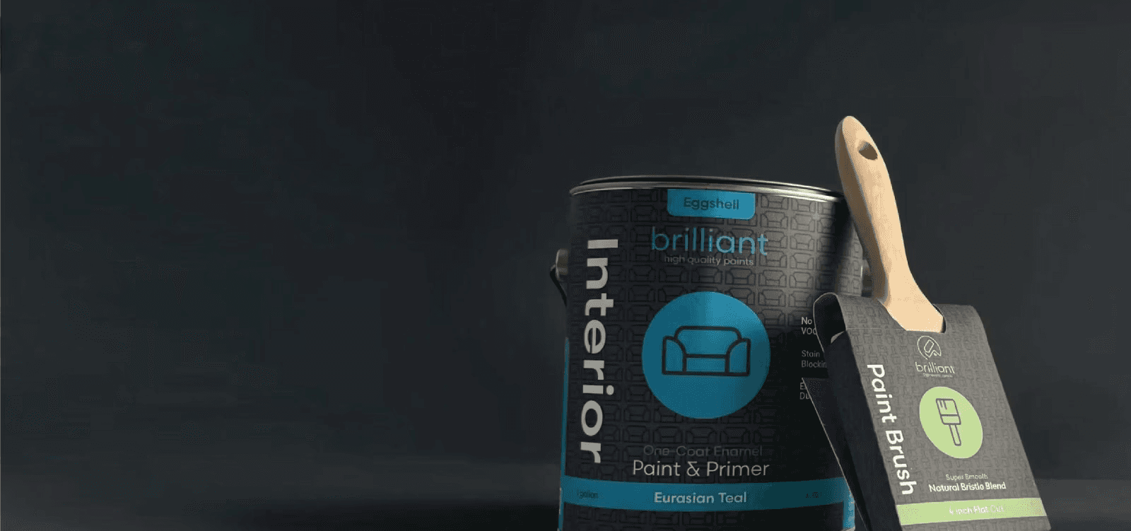
Full brand identity system, packaging design, and digital presence for a premium paint manufacturer.
Full brand identity system, packaging design, and digital presence for a premium paint manufacturer.
Branding
Stationery
Package Design
DELIVERABLES
Brand + Packaging + Stationery
DELIVERABLES
Brand + Packaging + Stationery
TIMELINE
9 Weeks
TIMELINE
9 Weeks
TIMELINE
9 Weeks
BRAND TONE
Modern, Colorful, Hi-end.
BRAND TONE
Modern, Colorful, Hi-end.
DELIVERABLES
Brand + Packaging + Stationery
TIMELINE
9 Weeks
BRAND TONE
Modern, Colorful, Hi-end.
BRIEF
Brilliant High Quality Paints called for a complete brand identity system, one built around a clear tension: high-end quality with a conscience.
Brilliant's core proposition is paint that delivers exceptional coverage and hundreds of colour options, entirely free of VOCs, the chemicals responsible for headaches, nausea, and long-term health risks, during and after painting.
TARGET AUDIENCE
The target audience is design-literate: architects, interior designers, and decorators who care as much about what's in the product as how it looks on the wall.
The logo and everything it leaves out
The problem
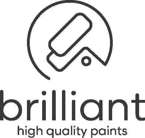
Brilliant's edge is what it leaves out: zero VOCs, no shortcuts, no excess. The mark had to do the same. Stand for a clean product, without any unnecessary detail.
The Solution
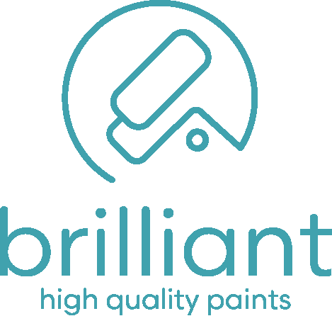
One continuous line. Fluid and deliberate. The simplest possible form, carrying the entire range from a single idea.
Construction
The line flows unbroken into a paint roller at the center of the mark. Negative space and geometric forms create directional cues that read as both interior and exterior, so one mark serves the whole range instead of splitting into separate marks per product.
What didn't make it
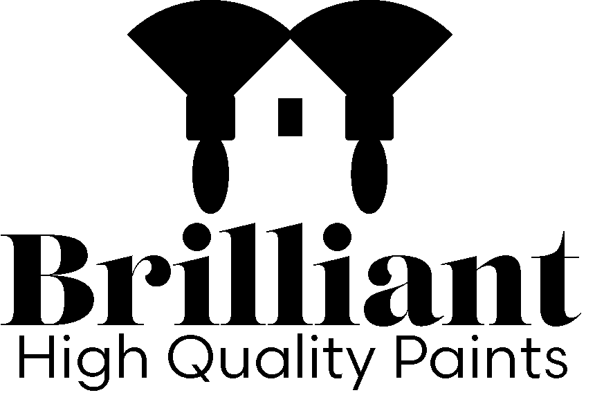
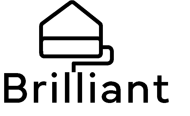
Earlier attempts shouted "paint company": bolder icons, literal tools, marks trying to say everything at once. All rejected for the same reason: too much. Brilliant needed quiet confidence, not volume.
The result
A mark you understand at a glance. Effortless. Memorable. Brilliant.
Rough Sketches


What didn't make it
Earlier attempts shouted "paint company": bolder icons, literal tools, marks trying to say everything at once. All rejected for the same reason: too much. Brilliant needed quiet confidence, not volume.
The result
A mark you understand at a glance. Effortless. Memorable. Brilliant.


FINAL LOGO

TYPOGRAPHY & COLOR
Scandia
Primary - Medium and Regular
Typography
Scandia carries the same restraint as the mark: geometric, clean, confident without trying. It holds up small on a label and large across a billboard, so one typeface runs the entire system.
Color
Teal resonated most: clean without feeling cold, natural without feeling muted, and vibrant without being loud. A charcoal base keeps both the mark and the packaging color range grounded, and lets each product's color do the sorting: different where it needs to be, but stays cohesive.
packaging designed
for the shelf
The Problem
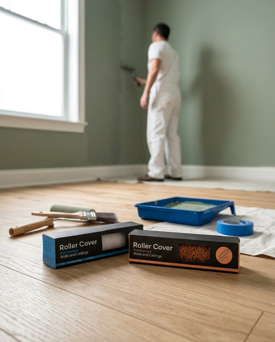
Brilliant isn't one product. It's a range: interior cans, exterior cans, brushes, covers, rollers, all on a crowded shelf. It has to read as one family, and a customer has to be able to find the right product without stopping to think.
The system
One charcoal base runs across everything so that it grounds the range of products and makes every item read as part of the same company. On top of it, a color and an illustration for each product do the sorting: telling products apart at a glance, keeping confusion to a minimum. The colors don't quite relate to what's inside but are rather used as a nod to the range of colors Brilliant makes.
The Pattern
Each product carries a pattern built from its own icon: sofas across interior, houses across exterior, etc. Up close it reads almost like an architect's diagram: a quiet nod to the designers and architects Brilliant is built for, and a way to make the base interesting instead of plain charcoal. It helps emphasize what the product is for before you read a word.
The Result
A shelf that sorts itself. One family, grounded in charcoal, told apart by color and illustration. A system that takes the customers' experience and adds to it.
The Pattern
Each product carries a pattern built from its own icon: sofas across interior, houses across exterior, etc. Up close it reads almost like an architect's diagram: a quiet nod to the designers and architects Brilliant is built for, and a way to make the base interesting instead of plain charcoal. It helps emphasize what the product is for before you read a word.
The Result
A shelf that sorts itself. One family, grounded in charcoal, told apart by color and illustration. A system that takes the customers experience and adds to it.
Packaging Icons & COLORs

Interior
Exterior

Flat Brush

Angle Brush

Rough Cover

Smooth Cover

Interior
Exterior
Rough Cover
Smooth Cover
Flat Brush
Angle Brush
DELIVERABLES
Brand + Packaging + Stationery
TIMELINE
9 Weeks
BRAND TONE
Modern, Colorful, Hi-end.
BRIEF
Brilliant High Quality Paints called for a complete brand identity system, one built around a clear tension: high-end quality with a conscience.
Brilliant's core proposition is paint that delivers exceptional coverage and hundreds of colour options, entirely free of VOCs, the chemicals responsible for headaches, nausea, and long-term health risks, during and after painting.
TARGET AUDIENCE
The target audience is design-literate: architects, interior designers, and decorators who care as much about what's in the product as how it looks on the wall.
The logo and
everything it leaves out
The problem
Brilliant's edge is what it leaves out: zero VOCs, no shortcuts, no excess. The mark had to do the same. Stand for a clean product, without any unnecessary detail.
The Solution
One continuous line. Fluid and deliberate.
The simplest possible form, carrying the entire range from a single idea.
Construction
The line flows unbroken into a paint roller at the center of the mark. Negative space and geometric forms create directional cues that read as both interior and exterior, so one mark serves the whole range instead of splitting into separate marks per product.
Rough Sketches
What didn't make it
Earlier attempts shouted "paint company": bolder icons, literal tools, marks trying to say everything at once. All rejected for the same reason: too much. Brilliant needed quiet confidence, not volume.
The result
A mark you understand at a glance. Effortless. Memorable. Brilliant.
FINAL LOGO
TYPOGRAPHY & COLOR
Scandia
Primary - Medium and Regular
Typography
Scandia carries the same restraint as the mark: geometric, clean, confident without trying. It holds up small on a label and large across a billboard, so one typeface runs the entire system.
Color
Teal resonated most: clean without feeling cold, natural without feeling muted, and vibrant without being loud. A charcoal base keeps both the mark and the packaging color range grounded, and lets each product's color do the sorting: different where it needs to be, but stays cohesive.
packaging
designed for the shelf
The Problem
Brilliant isn't one product. It's a range: interior cans, exterior cans, brushes, covers, rollers, all on a crowded shelf. It has to read as one family, and a customer has to be able to find the right product without stopping to think.
The system
One charcoal base runs across everything so that it grounds the range of products and makes every item read as part of the same company. On top of it, a color and an illustration for each product do the sorting: telling products apart at a glance, keeping confusion to a minimum. The colors don't quite relate to what's inside but are rather used as a nod to the range of colors Brilliant makes.
The Pattern
Each product carries a pattern built from its own icon: sofas across interior, houses across exterior, etc. Up close it reads almost like an architect's diagram: a quiet nod to the designers and architects Brilliant is built for, and a way to make the base interesting instead of plain charcoal. It helps emphasize what the product is for before you read a word.
The Result
A shelf that sorts itself. One family, grounded in charcoal, told apart by color and illustration. A system that takes the customers' experience and adds to it.
Packaging Icons & COLORs
Interior
Exterior
Flat Brush
Angle Brush
Rough Cover
Smooth Cover
Interior
Exterior
Rough Cover
Smooth Cover
Flat Brush
Angle Brush
DELIVERABLES
Brand + Packaging + Stationery
TIMELINE
9 Weeks
BRAND TONE
Modern, Colorful, Hi-end.
BRIEF
Brilliant High Quality Paints called for a complete brand identity system, one built around a clear tension: high-end quality with a conscience.
Brilliant's core proposition is paint that delivers exceptional coverage and hundreds of colour options, entirely free of VOCs, the chemicals responsible for headaches, nausea, and long-term health risks, during and after painting.
TARGET AUDIENCE
The target audience is design-literate: architects, interior designers, and decorators who care as much about what's in the product as how it looks on the wall.
TYPOGRAPHY & COLOR
Scandia
Primary - Medium and Regular
Typography
Scandia carries the same restraint as the mark: geometric, clean, confident without trying. It holds up small on a label and large across a billboard, so one typeface runs the entire system.
Color
Teal resonated most: clean without feeling cold, natural without feeling muted, and vibrant without being loud. A charcoal base keeps both the mark and the packaging color range grounded, and lets each product's color do the sorting: different where it needs to be, but stays cohesive.
packaging designed for the shelf
The Problem
Brilliant isn't one product. It's a range: interior cans, exterior cans, brushes, covers, rollers, all on a crowded shelf. It has to read as one family, and a customer has to be able to find the right product without stopping to think.
The system
One charcoal base runs across everything so that it grounds the range of products and makes every item read as part of the same company. On top of it, a color and an illustration for each product do the sorting: telling products apart at a glance, keeping confusion to a minimum. The colors don't quite relate to what's inside but are rather used as a nod to the range of colors Brilliant makes.
The Pattern
Each product carries a pattern built from its own icon: sofas across interior, houses across exterior, etc. Up close it reads almost like an architect's diagram: a quiet nod to the designers and architects Brilliant is built for, and a way to make the base interesting instead of plain charcoal. It helps emphasize what the product is for before you read a word.
The Result
A shelf that sorts itself. One family, grounded in charcoal, told apart by color and illustration. A system that takes the customers' experience and adds to it.
The Pattern
Each product carries a pattern built from its own icon: sofas across interior, houses across exterior, etc. Up close it reads almost like an architect's diagram: a quiet nod to the designers and architects Brilliant is built for, and a way to make the base interesting instead of plain charcoal. It helps emphasize what the product is for before you read a word.
The Result
A shelf that sorts itself. One family, grounded in charcoal, told apart by color and illustration. A system that takes the customers experience and adds to it.
The logo and everything it leaves out
The problem
Brilliant's edge is what it leaves out: zero VOCs, no shortcuts, no excess. The mark had to do the same. Stand for a clean product, without any unnecessary detail.
The Solution
One continuous line. Fluid and deliberate. The simplest possible form, carrying the entire range from a single idea.
Construction
The line flows unbroken into a paint roller at the center of the mark. Negative space and geometric forms create directional cues that read as both interior and exterior, so one mark serves the whole range instead of splitting into separate marks per product.
What didn't make it
Earlier attempts shouted "paint company": bolder icons, literal tools, marks trying to say everything at once. All rejected for the same reason: too much. Brilliant needed quiet confidence, not volume.
The result
A mark you understand at a glance. Effortless. Memorable. Brilliant.
Rough Sketches
What didn't make it
Earlier attempts shouted "paint company": bolder icons, literal tools, marks trying to say everything at once. All rejected for the same reason: too much. Brilliant needed quiet confidence, not volume.
The result
A mark you understand at a glance. Effortless. Memorable. Brilliant.
FINAL LOGO
Packaging Icons & COLORs
Interior
Exterior
Flat Brush
Angle Brush
Rough Cover
Smooth Cover
Interior
Exterior
Rough Cover
Smooth Cover
Flat Brush
Angle Brush
DELIVERABLES
Brand + Packaging + Stationery
TIMELINE
9 Weeks
BRAND TONE
Modern, Colorful, Hi-end.
BRIEF
Brilliant High Quality Paints called for a complete brand identity system, one built around a clear tension: high-end quality with a conscience.
Brilliant's core proposition is paint that delivers exceptional coverage and hundreds of colour options, entirely free of VOCs, the chemicals responsible for headaches, nausea, and long-term health risks, during and after painting.
TARGET AUDIENCE
The target audience is design-literate: architects, interior designers, and decorators who care as much about what's in the product as how it looks on the wall.
The logo and everything it leaves out
The problem
Brilliant's edge is what it leaves out: zero VOCs, no shortcuts, no excess. The mark had to do the same. Stand for a clean product, without any unnecessary detail.
The Solution
One continuous line. Fluid and deliberate. The simplest possible form, carrying the entire range from a single idea.
Construction
The line flows unbroken into a paint roller at the center of the mark. Negative space and geometric forms create directional cues that read as both interior and exterior, so one mark serves the whole range instead of splitting into separate marks per product.
What didn't make it
Earlier attempts shouted "paint company": bolder icons, literal tools, marks trying to say everything at once. All rejected for the same reason: too much. Brilliant needed quiet confidence, not volume.
The result
A mark you understand at a glance. Effortless. Memorable. Brilliant.
Rough Sketches
What didn't make it
Earlier attempts shouted "paint company": bolder icons, literal tools, marks trying to say everything at once. All rejected for the same reason: too much. Brilliant needed quiet confidence, not volume.
The result
A mark you understand at a glance. Effortless. Memorable. Brilliant.
FINAL LOGO
TYPOGRAPHY & COLOR
Scandia
Primary - Medium and Regular
Typography
Scandia carries the same restraint as the mark: geometric, clean, confident without trying. It holds up small on a label and large across a billboard, so one typeface runs the entire system.
Color
Teal resonated most: clean without feeling cold, natural without feeling muted, and vibrant without being loud. A charcoal base keeps both the mark and the packaging color range grounded, letting each product's color do the sorting: different where it needs to be, while staying cohesive.
packaging designed
for the shelf
The Problem
Brilliant isn't one product. It's a range: interior cans, exterior cans, brushes, covers, rollers, all on a crowded shelf. It has to read as one family, and a customer has to be able to find the right product without stopping to think.
The system
One charcoal base runs across everything so that it grounds the range of products and makes every item read as part of the same company. On top of it, a color and an illustration for each product do the sorting: telling products apart at a glance, keeping confusion to a minimum. The colors don't quite relate to what's inside but are rather used as a nod to the range of colors Brilliant makes.
The Pattern
Each product carries a pattern built from its own icon: sofas across interior, houses across exterior, etc. Up close it reads almost like an architect's diagram: a quiet nod to the designers and architects Brilliant is built for, and a way to make the base interesting instead of plain charcoal. It helps emphasize what the product is for before you read a word.
The Result
A shelf that sorts itself. One family, grounded in charcoal, told apart by color and illustration. A system that takes the customers' experience and adds to it.
The Pattern
Each product carries a pattern built from its own icon: sofas across interior, houses across exterior, etc. Up close it reads almost like an architect's diagram: a quiet nod to the designers and architects Brilliant is built for, and a way to make the base interesting instead of plain charcoal. It helps emphasize what the product is for before you read a word.
The Result
A shelf that sorts itself. One family, grounded in charcoal, told apart by color and illustration. A system that takes the customers experience and adds to it.
Packaging Icons & COLORs
Interior
Exterior
Flat Brush
Angle Brush
Rough Cover
Smooth Cover
Interior
Exterior
Rough Cover
Smooth Cover
Flat Brush
Angle Brush

DELIVERABLES
Brand + Packaging + Stationery
TIMELINE
9 Weeks
BRAND TONE
Modern, Colorful, Hi-end.
BRIEF
Brilliant High Quality Paints called for a complete brand identity system, one built around a clear tension: high-end quality with a conscience.
Brilliant's core proposition is paint that delivers exceptional coverage and hundreds of colour options, entirely free of VOCs, the chemicals responsible for headaches, nausea, and long-term health risks, during and after painting.
TARGET AUDIENCE
The target audience is design-literate: architects, interior designers, and decorators who care as much about what's in the product as how it looks on the wall.
The logo and
everything it leaves out
The problem
Brilliant's edge is what it leaves out: zero VOCs, no shortcuts, no excess. The mark had to do the same. Stand for a clean product, without any unnecessary detail.
The Solution
One continuous line. Fluid and deliberate.
The simplest possible form, carrying the entire range from a single idea.
Construction
The line flows unbroken into a paint roller at the center of the mark. Negative space and geometric forms create directional cues that read as both interior and exterior, so one mark serves the whole range instead of splitting into separate marks per product.
Rough Sketches
What didn't make it
Earlier attempts shouted "paint company": bolder icons, literal tools, marks trying to say everything at once. All rejected for the same reason: too much. Brilliant needed quiet confidence, not volume.
The result
A mark you understand at a glance. Effortless. Memorable. Brilliant.
FINAL LOGO
TYPOGRAPHY & COLOR
Scandia
Primary - Medium and Regular
Typography
Scandia carries the same restraint as the mark: geometric, clean, confident without trying. It holds up small on a label and large across a billboard, so one typeface runs the entire system.
Color
Teal resonated most: clean without feeling cold, natural without feeling muted, and vibrant without being loud. A charcoal base keeps both the mark and the packaging color range grounded, and lets each product's color do the sorting: different where it needs to be, but stays cohesive.
packaging
designed for the shelf
The Problem
Brilliant isn't one product. It's a range: interior cans, exterior cans, brushes, covers, rollers, all on a crowded shelf. It has to read as one family, and a customer has to be able to find the right product without stopping to think.
The system
One charcoal base runs across everything so that it grounds the range of products and makes every item read as part of the same company. On top of it, a color and an illustration for each product do the sorting: telling products apart at a glance, keeping confusion to a minimum. The colors don't quite relate to what's inside but are rather used as a nod to the range of colors Brilliant makes.
The Pattern
Each product carries a pattern built from its own icon: sofas across interior, houses across exterior, etc. Up close it reads almost like an architect's diagram: a quiet nod to the designers and architects Brilliant is built for, and a way to make the base interesting instead of plain charcoal. It helps emphasize what the product is for before you read a word.
The Result
A shelf that sorts itself. One family, grounded in charcoal, told apart by color and illustration. A system that takes the customers experience and adds to it.
Packaging Icons & COLORs
Interior
Exterior
Flat Brush
Angle Brush
Rough Cover
Smooth Cover
Interior
Exterior
Rough Cover
Smooth Cover
Flat Brush
Angle Brush


Previous Project
Previous Project
Previous Project
Return to Top
Return to Top
Next Project
Next Project
Next Project
Return to Top
©2026 jfgrijalvadesign. All Rights Reserved
©2026 jfgrijalvadesign. All Rights Reserved
©2026 jfgrijalvadesign. All Rights Reserved